Illustrations for communities
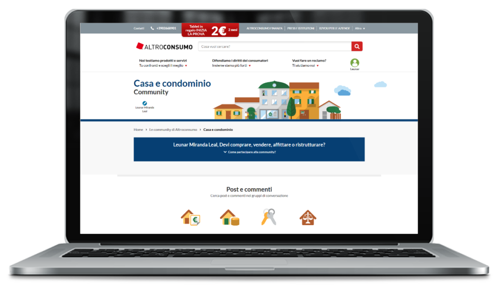
My client required a series of illustrations and icon sets to use for discussion groups they were organizing among their user base. These had topics of discussion such as the cost of living, energy and the offers and services of telecommunication companies, as well as interesting offers or tips for family vacations. Each would have a specific color palette and a set of header illustrations and matching icons.
Brief
My client, a consumers’ association, required a series of illustrations and icons sets to use for discussion groups of their customers that they brought together among their user base, each centered on a different topic. They called these groups Communities. Each community would also require extra icons to illustrate subtopics. All illustrations and icons needed to be in the flat visual style in order to match the rest of the UI of the website and most icons were already in use elsewhere and would just be adjusted for the given palette.
Palette
For a first batch of illustrations I made use of a single color with a few declinations, or two very similar colors to complement each other, as is the case with telecommunications, which makes use of different tones of blue.
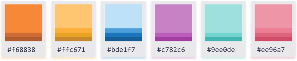
However the client kept adding communities later on, with no definitive list of how many would make up the final set, despite the first sets already going online. So for later sets, I made use of two main complementing colors, such as aqua and red for the Health discussion community, or green and brown for an earthy feeling in the Nutrition and cooking community.
Illustrations
In order to create illustrations that could cover such different topics as travel and finances but still keep a visual style throughout, I played with different perspectives for the images, from the image of people in the distance as if living in a diorama, to a close-up from the top as if a first-person view, looking down at a desk or a table.