UI Challenge
I created an app for workouts related directly to specific challenges and “adventures” as a UI workout, in order to practice my UI skills and explore different, more visual-focused styling.
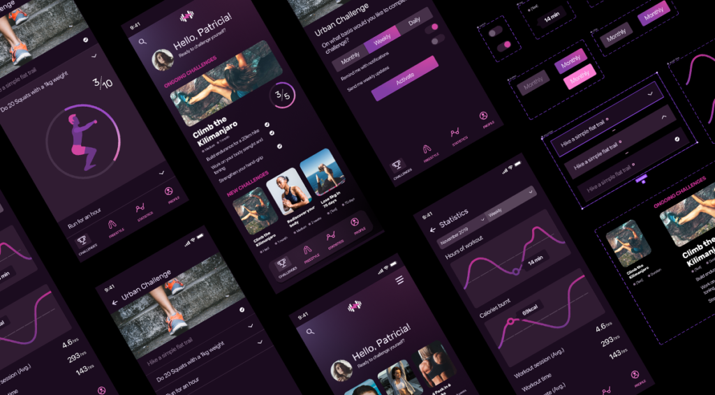
The original brief came from an on-demand design platform as an actual submission for a paid gig. Working in more corporate environments, it is not often that I get the opportunity to experiment with more contemporary or impactful color-combinations and visual styling in my UX/UI design work. I produce these layouts as a style exercise in order to test and experiment, to get more acquainted with these kinds of design and in particular to hone my UI-driven skills.
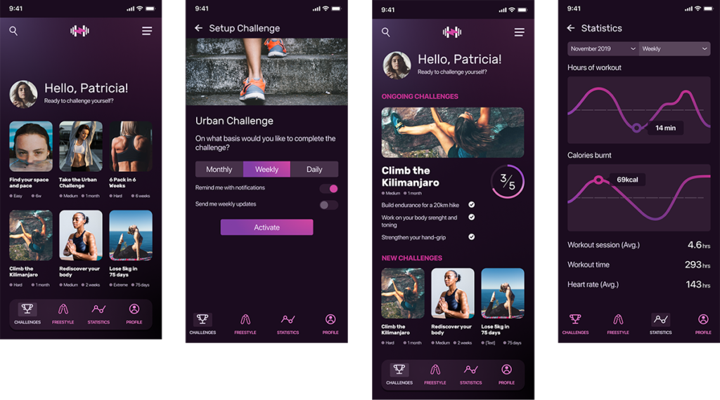
The concept of the UI is a modern, somewhat sci-fi look and feel, with some elements of 80’s retrofuture styling, which together with 90’s early web design brutalism has been characterizing the more edgy contemporary design of the last five years or so.
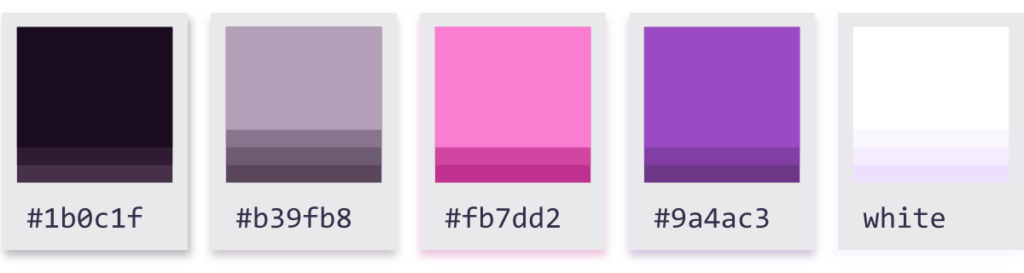
The color palette is a dark-theme. For the highlights it uses a single point or a gradient that goes from a bright pink to an intense violet. All shades of grey that make up the base of the shapes and their separation, are very dark prune tones, and most very light colors are also very light lilacs, close to white but not quite.
For the base typography I kept the system typography (San Francisco in the case of iOS) for simple reasons of legibility and availability. I chose Rubik for the titles for its squared shapes and sans rounded edges give it that modern feel that properly matched the concept of the UI while still being widely available (a Google font).